Collecting donations online is essential for any school or university.
However, the donation page itself is often an ignored afterthought. I mean, does it really make a difference if the page looks a little different or use slightly different text?
The answer is a resounding, "Yes!" In this post, we will discuss 8 ways you can optimize your school's donation page to improve your higher education fundraising efforts.
Donation page optimization tips
- Remove navigation menu
- Use pre-filled fields
- Add eye-catching imagery
- Present the problem and solution
- Use preset donation amounts
- Leverage upsells for recurring donations
- Limit fields on donation page
- Remove videos and lengthy copy
1. Remove navigation menu
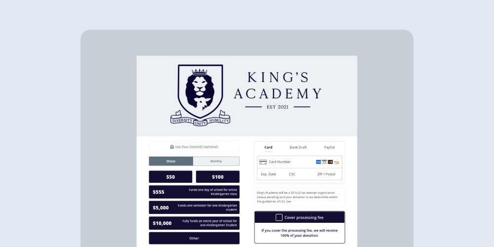
One of the most common mistakes we see schools and universities make with their giving pages is simply embedding a donation form from their CRM into a page.
This is a big mistake!
Your giving page should be optimized for conversions, which means it should not have a navigation bar and the focus should be on the donation form itself.
At Anedot, we always recommend that our customers use our Hosted forms, which are highly optimized for conversion as opposed to embedding our form into their website.
In a NextAfter experiment, their client had a 195.1% improvement in conversion when they removed the navigation bar from their giving page.
2. Use pre-filled fields
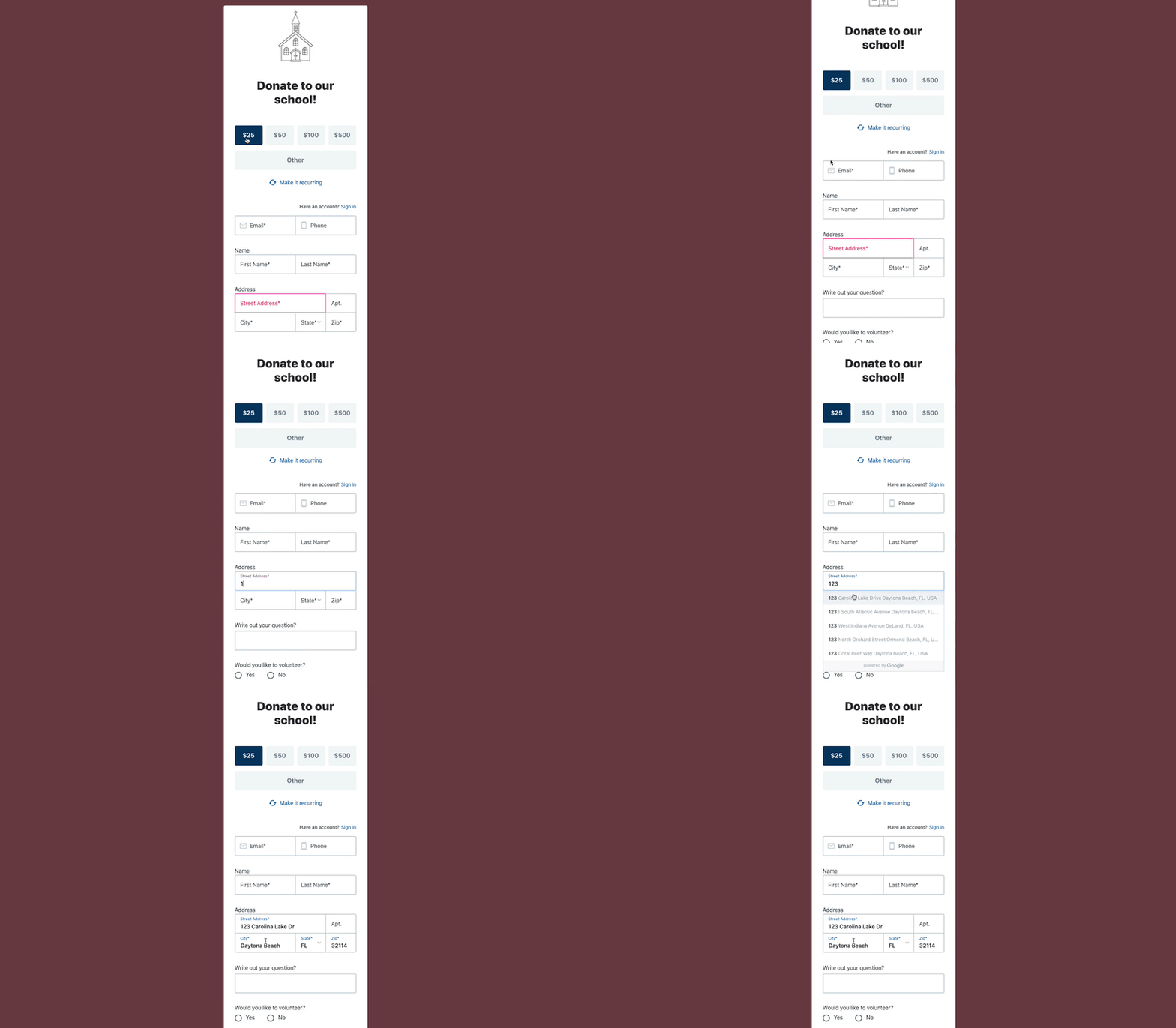
Many giving forms require donors to fill out every part of the form without any context.
For example, this could include needing to type out an entire address or typing in their credit card without the system properly catching any errors.
At Anedot, we leverage Google to find the address closest to someone when they start typing it in so they can simply click it after typing in a few numbers.
This is crucial so someone doesn't type in all lower or upper case and doesn't misspell their city. It also speeds up the process too!
For credit cards, if someone types in 37828 for example, it will immediately show the American Express logo. It tells a donor if they've typed in their card incorrectly.
3. Add eye-catching imagery
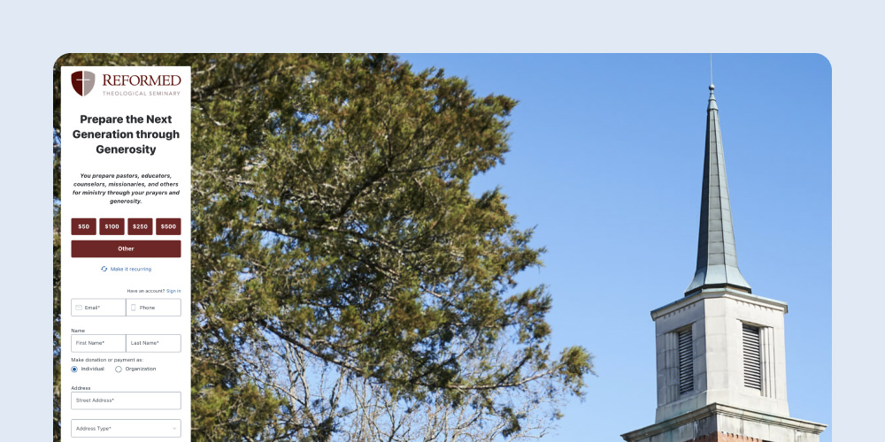
Branding is extremely important when considering giving page design.
When navigating to a donation landing page from social media, email, or a website, the donor should feel like they are receiving a consistent experience.
High-resolution imagery is critical for this. That includes a professional logo in the header and a high-resolution image in the background.
Alternatively, you could also use a secondary color to make the page stand out. Remember that the background image will not be seen on phones anyway and the majority of donors will give via phone.
NextAfter found that improved imagery could improve conversions by 19.8%.
4. Present the problem and solution

You might be thinking "someone's on my website, of course, they want to give to my college!"
However, there may be someone who's still on the fence about giving and they need that extra push to be convinced.
When you are writing copy for your giving page, you should have a clear and compelling reason why someone should give.
For every dollar, what does that mean for a student? Can you tell a story of someone who's been helped before? These are all relevant ways to make someone feel better about their gift.
A simple sentence or two really can make a big difference! NextAfter found that adding compelling copy improved conversions by 28%.
5. Use preset donation amounts
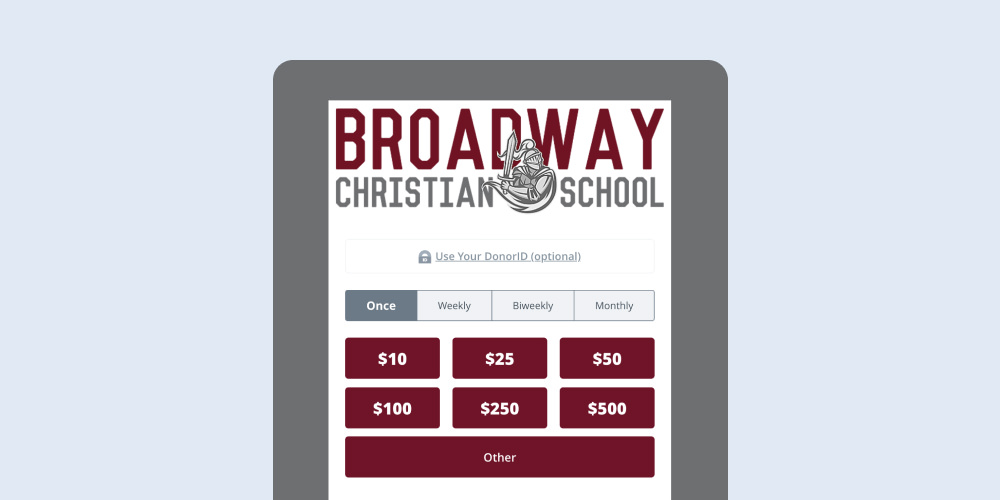
Many schools leave a simple "Amount" section where someone can type in how much they want to give. However, that can cause mental strife if they have to think more through the process.
Optimally, you will have a simple row of easy to see buttons that they can click on. These buttons should match the audience who will be landing on the page.
For example, major donors should not be driven to a donation page with buttons under $100 while small-dollar donors should not be driven to pages asking for thousands.
At Anedot, we make this a bit easier with URL Parameters. This allows you to dynamically set button amounts inside a URL to show different sets of amounts depending on the audience.
6. Leverage upsells for recurring donations
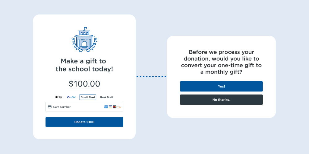
Converting a donor from a one-time giver to a recurring donor is one action that will generate the greatest return on investment (ROI) for a college.
While it's very important to include the option for someone to select to give monthly, many donors will not choose to do so when prompted. You should have a follow up ask after they agree to give.
At Anedot, we have a popup recurring upsell that allows you to customize a popup to ask a donor to give a recurring donation instead of a one time gift. We have found asking a donor for a bit less on their monthly gift is the best route.
Usually, a 50-60% ask will provide the highest conversion rate.
Platform wide, our customers have seen a conversion rate of 13% on these high-converting upsells.
We also have a credit card auto-updater built in too, so if a recurring donor has a new card expiration date, our system will communicate securely with card brands like American Express to update the card for the donor.
7. Limit fields on donation page
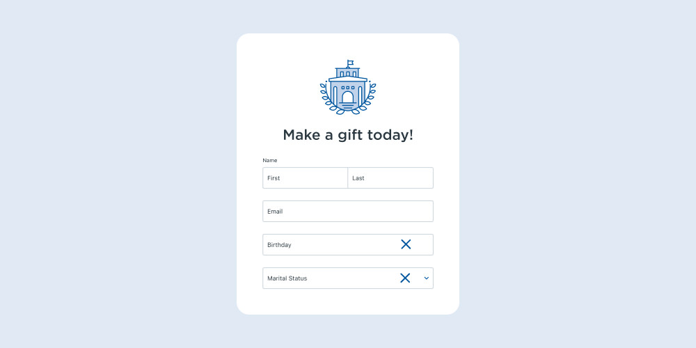
Many schools want to collect a lot of information on their donation page. However, each additional item you ask for will lower your conversion rate on pages.
Every second a donor has to spend typing in more information makes them less likely to give.
You should ask yourself what information you need and what information can be deduced or collected later.
If a piece of information is "nice to have," then you can always send a follow-up survey or email to collect it.
It's more important to receive the donation than worry about collecting data that, ultimately, may not be necessary.
8. Remove videos and lengthy copy
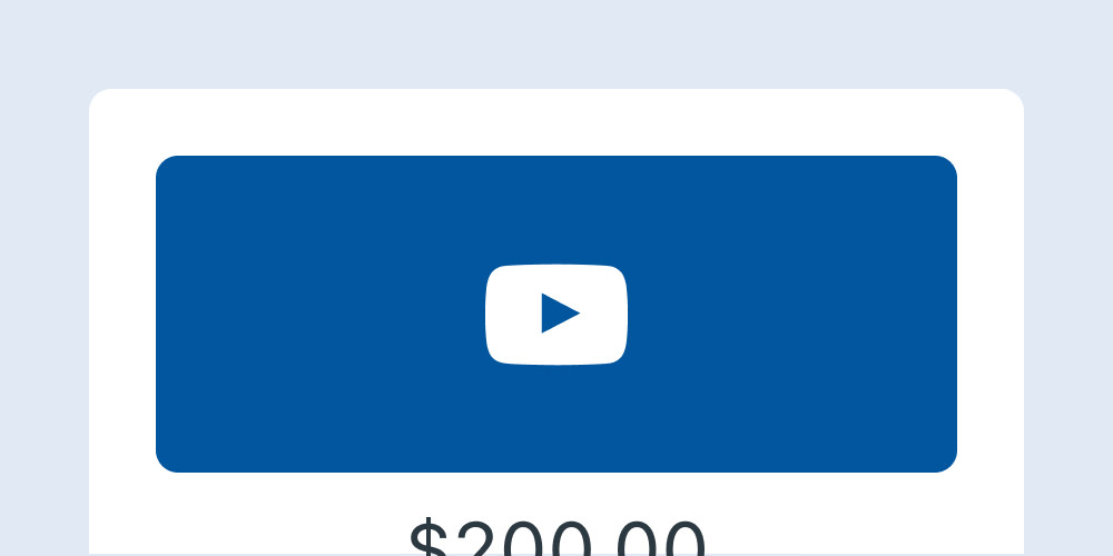
Videos are catchy and many may believe the friendly face of the President of their college will help convert more donors. Unfortunately, the data is harshly in the other direction.
The problem with videos is that they often take up a large amount of space, which pushes the donation form much further down the page "below the fold."
This is particularly problematic when you're on a cell phone and there isn't much room on your screen to see the donation form.
This same principle applies to walls of text too. If people need to scroll a lot to find your donation form, it will make them less likely to give.
NextAfter has shown through experiments that videos can reduce your conversions by over 500%:
- How video on a donation page affects donor conversion
- How a video impacts the conversion rate of a donation page
Final thoughts
And that’s it! As you can see, there are many considerations when building a donation page that can have a big impact on your bottom line.
We’ve mentioned this a few times, but Anedot Action Pages are built for conversion and incorporate many of these best practices.
There are no monthly fees or set up fees, and we have a customer support team dedicated to your success.
80 Community Service Ideas for Nonprofits

