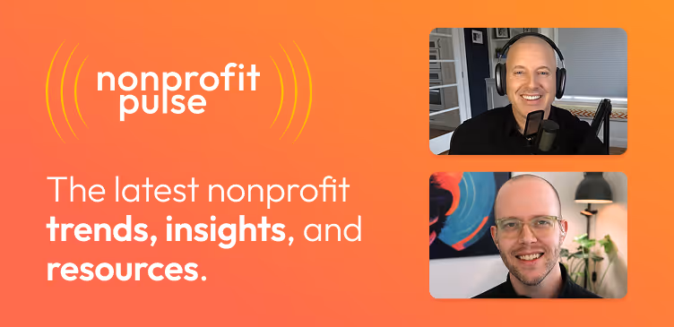
Anedot Learn session transcript ↓
Colleen:
Hey, this is Colleen from Anedot. Welcome to Anedot Learn where we help you grow your organization through giving.
Today we're joined by Rebekah Josefy who is the Vice President of Client Services at NextAfter.
Today, she'll be sharing valuable information with real examples on how to equip you to develop testing ideas for how to message your email communications, landing pages, and donation pages.
So, Rebekah we're so happy to have you here, and I've been so excited to record this episode and just learn from you and the wealth of information that you have for us.
So if you just want to kick it off by introducing yourself, telling us a little bit about NextAfter, that would be a great place to start.
Rebekah:
Awesome. Thanks so much, Colleen. I'm so excited to be able to have this conversation with you today and hopefully help everyone who's tuning into Anedot Learn just how they can develop their own test ideas for their landing pages, donation pages, anywhere on their website where they're wanting to get a learning.
So just to share a little bit about NextAfter for anyone who's not familiar, I'd love to tell you a little bit about who we are.
NextAfter is really three things. We are a fundraising research lab, which means we conduct research and we do A/B testing.
We use the internet as a research lab to do digital experimentation, to discover what works to raise more money online.
We're also a digital fundraising consultancy, so we actually work in partnership side by side with several nonprofit organizations to help them execute strategy to generate their online program growth.
And then third, we are also an institute for online fundraising. So we believe in giving away our research with everyone in the nonprofit industry, fundraisers, digital marketers, equipping them with research, resources, and training.
So we really just attempt to answer our questions what works in nonprofit fundraising and what motivates donors to be generous. So we're very curious.
We've logged over 5,000 experiments to date. That again, we give away those learnings for anyone else who's trying to grow generosity in their space.
Colleen:
Wonderful. It's awesome to hear.
I know on our past Anedot Learns too we've even shared some of your experiments so we're excited to learn more and have more.
3 questions to ask to guide your A/B testing efforts

Rebekah:
Well what I’d love to do today, Colleen, is really pose some questions for nonprofit practitioners to think about when they're brainstorming test ideas.
Kind of designing treatments for their emails, for their landing pages, donation pages, the homepage of their website, Facebook ads, and really think about test ideas beyond, you know, what people typically think about when they think about A/B testing.
They think, oh, let's test the color of a button or let's test the call to action language on our donation form button or the dollar handles on your gift array.
These are kind of some of the natural things that people think about when they think about A/B testing.
So I'd like to do today is just give a few questions to help think even deeper about some psychological motivations that prompt our donors to give.
Because really we believe in a couple key principles that drive the majority of the language that we use on donation pages, and that's that people give to people, not email machines.
And the second is that people will treat purely digital experiences like their experiences with real people, right?
So a conversation like the one you and I are having right now, Dr. BJ Fogg, has kind of labeled this as what we call social presence.
So humans, you and I, are hardwired to respond to cues in our environment.
So especially things that feel alive in some way.
So we want to really ask the question:
How can you make a person feel like they aren't being marketed to, but rather that they're being communicated with?
Question 1: Does a new website visitor with little exposure to your organization have enough information to make a gift?

Rebekah:
So the first question I want to just challenge our nonprofit practitioner friends in the field to think about is does a brand new visitor with little exposure to my organization have enough information to be able to make a gift?
So we want to make our conversations in the email inbox with our donors look less like marketing, right?
Immediately, when you see this email, you know that this didn't really come from a real person and it's from a brand, it's from an organization.
And so we really want to take out the thing that makes it feel like marketing and really make it feel more personal, like a 1 to 1 conversation.
What does this look like in your inbox?
It starts by just saying hello, calling your donors by name, starting with a warm greeting, maybe even having “Hi Colleen” and say, “I hope you're doing well today.”
You know, just as we would have a conversation with each other in person. Our goal of all of our communication is to have a conversation, not to force someone to give.
So the first question, again, as people are sitting down thinking, how can I do A/B testing for my organization beyond the technical aspects, but really getting to the heart of the message that they're presenting.
The first question to, again, generate test ideas and start brainstorming is how are my donors going to receive this message?
You know, pull up your main donation page, pull up an instant donation page on your site and really just look at it and evaluate it.
And you know, is there a message on the page? Because sometimes we see there's just a hero image and there's no conversation, there's no context. And so really just evaluating what message are we putting out there? Is there one?
If so, is that message clear to understand?
And then is someone who's brand new to my organization? I think one of the things that is the most difficult hurdles to overcome, being in the nonprofit staff member’s seat is we know our organizations, we know what motivates us.
We know what our mission is. But are we communicating that to our donors or to our potential donors or to people who are curious and showed up on our donation page to learn more?
Are they, are we providing them with enough information to be able to make a gift? Are we assuming that they're showing up with enough appeal, with enough motivation to make a gift without us having to remind them, you know, why they should make a gift?
So when I look at some of those 5,000 experiments that I mentioned that really help demonstrate, again, all of our ideas are data based and research backed.
So I just want to show a couple examples of what testing this concept looks like. So I mentioned, you know, humanizing emails, making them feel less like marketing.
Here's one example where the original control email was sent from an organization.
You know, it had a very organization centric subject line. We tested that against a really personalized nonprofit email.
So this is an email that came from a human sender at the organization, someone who's, you know, boots on the ground level, someone who makes sense for this email to come from.
And the subject line we tested was, “Hey, I have a quick question.”
What we found by this personal style again, that removes that marketing feel from what we're experiencing in the inbox.
This led to a 330% in opens just by simply making it feel more conversational and taking away that marketing feel.
Another opportunity we've seen is adding personalization in the actual message.
We just added, these two messages were exactly identical other than this one little addition, which was “Hi” to the donor’s first name.
This led to a 270% increase in clicks just by, again, having that 1 to 1 conversation, making a person feel like they're being communicated with and not like they're on a distribution list.
So when we think about, again, a new visitor showing up on a page, if this is what they saw, would this be enough information to understand what's being asked of them?
You know, who the organization is, what they're trying to accomplish. So thinking about how do we replace a message that, again, we're assuming motivated, we're assuming that visitors are showing up with enough motivation to take the desired action.
But I love to encourage our nonprofit practitioner friends to test including a message of value proposition.
And what that means is asking the question like, why should I give to you rather than give to some other organization or not at all?
So this kind of control example is what uses something that we refer to as invisible language, right?
So this Christmas Change a Life, any other nonprofit organization that you know is doing any sort of work around the Christmas season could technically claim this and put it on their donation page as well.
But what we tested was actually clarifying why someone should make a gift, how their gift will be used and made this conversational.
“You can change a life with a gift today,” and then we explain exactly what that gift will go to. So explains why the organization needs support and how the donors gift will be used.
And when we made those changes and A/B tested this, we saw a 35% increase in the number of donations.
So sometimes, you know, we want to keep messaging simple, but we also want to make sure that, again, any visitor at any stage in their relationship with our organization could arrive on this page and have enough information to be able to make a decision about whether or not they would want to give.
Colleen:
Yeah, that's powerful. Very powerful.
Rebekah:
One other example of testing value proposition. Again, this is where we see, you know, the focus here is more on the form itself.
The only information someone has to give when they arrive on this page, this is the main donation page.
You know, they have one headline and an image, again, thinking about a brand new information, a brand new visitor with little to no exposure to my organization.
This does not give me enough information to say, yes, I should make a gift. So we tested actually including value proposition specific to the organization.
So starting a conversation, you know, hey, thank you for your interest in making a gift today.
We know where the people who arrive on this donation page are coming from. They're coming from that big donate button and then the right hand side of our website.
So they have some interest in making a gift because they clicked the button to learn more about donating. So again, just talking to people like we know where they are in the process.
And what we learned by testing value proposition on their main donation page was a 116% increase in donations.
So the, you know, the image and the headline wasn't enough to get people through this process.
They really needed that extra motivation, starting a conversation, letting them know we understand, you know, they're interested in making a gift and then helping them get to a point where they feel comfortable making that decision.
Question 2: How can you make your online giving process feel like less work for your donors?

Rebekah:
So the second question, again, want to look at some experiments that show this question and action, but how can I make this experience, you know, making a gift online?
How can I make that feel like less work and make this process more helpful to my donors?
So having a red button versus a green button doesn't really change the process at all for my visitor. However, when I think about how my donors are feeling, you know, do they want to go through a really complicated process in order to make a gift?
Usually not. So think about experiences in your own life where you feel frustration when you're asked to fill out lots of paperwork, when you're asked to go through a really complicated process just to achieve something that you have a goal to accomplish.
So think about going to a doctor's office and you know, you've been going to the same doctor's office for years.
But every time you show up, they hand you a clipboard and they start filling this out and, you know, just as humans who like things to be easy, naturally, you know, that creates some friction or resistance in us when we have an experience like that.
So one other kind of experience where I have personally felt that frustration is going to a gym and, you know, it's a franchise of gyms.
So they have locations everywhere. But every time you go and they think you're a new client, you have to fill in this client intake form, even though you've already given them all your information.
It's just, you know, it feels like a heavy process. It feels weighty, it feels like work. And again, as humans, we're predispositioned to want things to be easy and not be difficult.
So let's look at some experiments about how we take that frustration, we take that friction, and we remove it for our donors so we can help them feel like, hey, this process is easy, this process is not difficult.
And so one way that we can do that is thinking about how we're presenting information on our donation forms, right?
So things like the order of the form fields on our donation page.
Are we asking people to choose their frequency before their gift amount or are we asking them to choose a gift amount and then saying, okay, now choose the frequency when those steps kind of don't make sense out of order.
So thinking about again as someone chooses, oh, I'll give $50, you said that's the most popular gift.
Then you say, well, do you want to give that one time or monthly? Like, well, I kind of already made that decision when I chose the amount to give.
So we actually tested swapping those those two fields and the order that they're presented. Okay, do you want to give a one time or monthly gift? Then choose how much you want to give based on your one time or recurring giving selection.
Just removing that friction in the mind of the visitor when they're going through this process led to a 30% increase in donations.
We've also tested giving visitors more helpful information as they're reaching a decision. Right.
So we have here a premium offered for a gift of $100 or more, but we let the donor kind of choose their own adventure, put it in any amount in this box that you want to give that represents the value of the premium you'll be receiving.
We said, why don't we help the visitors have a better understanding of what are some, you know, acceptable donation amounts or what kind of give them a litmus test of here's what other people typically give to kind of give them a little bit of assistance in that process.
And so the decision making process is actually escalated. So they still have the option of that other field to put in a gift of their own choosing.
But we do give them a selection of sorts and a few handles to choose from.
By changing it from a one time donation amount to a gift array, we saw a 35% increase in donor conversion.
One other test I'll show you in terms of really making it feel like less work. Even one step further from that last test is not just showing them a gift array, actually leading them in the direction that they should be choosing.
So adding “most popular” to this gift array, just again giving people a sense of here's what most people who arrive on this page choose to give.
This led to a 94% increase in revenue for the organization just by giving people a sense of the direction that they should take.
Again, not everyone's going to choose that “most popular,” but it gives them a little bit of guidance in the process.
Ask ourselves the question, am I making this process feel like less work for our visitors and having it feel more helpful?
Question 3: What is the flow of conversation that you're having with your website visitors?

Rebekah:
The third question to kind of ask yourself as you're developing test ideas coming up, what treatments is what is the flow of conversation that I'm having with my visitors? So does it make sense?
You know, if I read a page out loud to someone, does it sound natural? Does it sound like I'm giving enough guidance or are there areas that could be improved?
So I really like to think about the dissonance between how a nonprofit would answer the phone and speak to a donor versus how their donation page comes across online.
Again, thinking about social presence, people will treat our donation page like it is alive.
So does that process in the donation page sound like a warm, friendly voice on the other end of the phone, who's helping someone go through the process of making a donation?
Or does it sound mean and bossy and just prompts and say, you know, enter your credit card information?
We would never say that to someone in a real life conversation. We would we would follow a script, almost of a conversation to help someone make a donation over the phone.
So one example I like to pull in from The Office is Dwight trying to sell Andy his car and just yelling at him like, hey, do it now. Shake my hand. Three, two, one, decide.
And so when we look at our donation pages, I'm sure you've seen this a lot, Colleen, in your experience, but it does feel very instructional, informative, but it does not sound friendly, conversational, personal.
It really does sound like the donation pages, you know, telling you what to do next. But just in a very demanding way.
So what I would challenge you as you're developing test ideas is to think:
Does your donation page feel like you're telling someone what to do? Or does it feel like you're giving them a moving sidewalk to help them achieve what they came here and intended to do?
Am I getting out of the way and helping them through that process, or am I putting them through an obstacle course of slow walkers at the airport, right?
It can really feel that way. Everyone's had that experience.
You're trying to get to your gate at the airport and you feel like you're dodging in and out of, you know, slow walkers. Whereas when you're on a moving sidewalk, it just really helps you get to your destination a little bit easier, a little bit smoother.
It's not going to save you a ton of time. But it does at least feel like you have that momentum, like you're moving forward.
So when you think about donation pages, again, asking those questions, does this make sense? And when I say it out loud, am I giving someone else a little bit more cognitive momentum to make it feel easier for them to arrive at the destination?
So we can cut this out? Because I just so let's look at some experiments for how we can put our pages visitors on a moving sidewalk.
So, you know, one thing to consider, a hypothesis that we're continually testing is words like “access” or “activate” things that suggest that the offer at hand is really easy to get, in contrast to words that feel like work for the user.
Right? So “download” that sounds like, oh, I've really got to, you know, stop everything else I'm doing today so I can download this offer versus access, activate things that just sound easy.
So that activation language that increases the value proposition element of appeal and exclusivity is a significantly more attractive way of describing what the user desires right?
So again, in our when we're wearing our nonprofit staff member team member hat, we're thinking about what do we want this person to do?
We want them to, you know, download our ebook. But what the user wants is to get free access. They want to get immediate access. They want to get exclusive access. Those are ways that we can motivate more people on the receiving end of that information to be more interested in the user’s desire of what they want.
So when we think about putting this to the test kind of out in the field, you know, the control has what I call kind of that narrator voice, you know, billing information, oh that sounds really motivating right? Honoree information, credit card information.
It's guiding the visitor. Yes. This is where you put your billing information. But we're expecting them to fill in a lot of the blanks here on their own.
So we tested this concept of, hey, what would I say if I answer the phone? Hey, choose the amount you would like to give. Can you tell me you know how much you're planning on giving today?
Step two, please provide your billing information. Step three, please provide your secure payment information.
So creating this donation page experience that feels alive, that feels polite, that feels conversational, as opposed to just adding headlines to each section of our donation form.
What we've learned when we ran this A/B test was there was an 18% increase in donations when people felt like they were having that conversation with the process on the donation form.
Closing thoughts

Rebekah:
So we talked about a lot of ideas, a lot of things to consider while you're coming up with test ideas.
So I just want to review again those three questions to help our nonprofit practitioner friends as they're building out A/B test ideas.
So question one, you know, how would my donors receive this message? Is there a message on the page or are we just relying on a graphic to communicate what we want our donors to do?
Is it clear to understand? And does someone who's brand new, who doesn't know the things that I know about our nonprofit organization, are we clearly communicating that to help them want to make a gift as well?
How can I make this experience feel like less work, make the process more helpful to my donors?
And then what is that flow of conversation that I'm having with my page visitors?
Does it make sense when I say this out loud? And are we really putting people on a moving sidewalk? Are we helping them get to that end destination that both we want and what they want, which is to be generous and to make a donation.
But we've got to put those guide rails in place. We've got to improve our conversations and not expect the donor to do the work when they're already showing up.
And so these are three questions that, again, when we think beyond technical A/B test, we think beyond just changing the color of a button.
Are we really thinking about how the process feels to our donors or making sure that we're caring for them in that process the same way we would if they walked in our doors and said, I'm interested in making a donation today?
What can you tell me that might move me one step closer to saying yes at the end of this process? So just two things to keep in mind.
Again, as we kind of close out our conversation today,
Be mindful of the fact that people will treat purely digital experiences like they are real experiences with real people.
So is your website, is your donation page a reflection of how you would treat someone in a real personal conversation? Or are there some gaps that could be tested out of and identify better ways to talk to our potential donors?
Because at the end of the day, at NextAfter we believe that people give to people, not email machines.
So especially in kind of this new surge of AI generated content and things like that, it is so important to note that we want to replicate those real life experiences on our donation pages as we help people uncover their motivations to give and help them be more generous.
So at the end of every piece that you're building and putting out for your nonprofit, how can you make someone feel like they're not being marketed to?
But how can you make them feel like they're truly being communicated with?
So if you have any questions about kind of the topics we've covered today at the test results, we would love for you to log your own test results if you put any of these concepts in motion, you can do that at winstonknows.com. But we'd love to see what you're testing, how your donors are responding.
You know, we can't promise green arrows for every organization, every time you test these concepts because your audience is different. Your audience will have their own levers to pull. They'll have their own motivations that they show up with.
But these are a good place to get started on testing and making those pages sound more conversational. But we'd love to help answer any questions you have in your kind of quest to acquire more donors and do the excellent work that your nonprofit organization has set out to accomplish.
So feel free to email me questions. This QR code will take you to my LinkedIn page. I'd be happy to connect with you there, but thank you, Colleen, for having me on today. Any other follow up questions?
Colleen:
This was beautiful. I love kind of, you know, the big takeaway to really encourage people to take a step back, kind of put themselves in the shoes of the person that’s supporting their organization.
And I love just the imagery of the moving sidewalk. And you gave such tangible like data to see, you know, how do we build that moving sidewalk by being personal, our communications with the supporter, making it personal.
And also, I love the tip too on language, of rather than “download,” which feels like there's a lot of friction there, using words like “activate” or “access.”
I just, you know, again, thank you for joining. I think there's always so much information gained in just the tips that you guys provide.
So thank you so much and thank you for adding your QR code and your email address so that people that watch this can contact you guys.
So thank you so much for joining. It's been a pleasure.
Rebekah:
Yeah, absolutely. Thank you, Colleen.
And thanks for having us on for Anedot Learn today. It's fun.
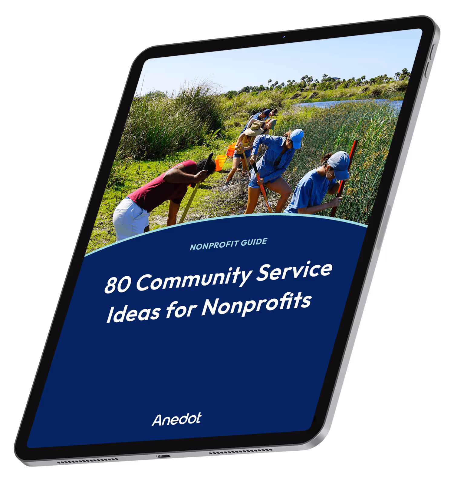
80 Community Service Ideas for Nonprofits